Using colors is probably one of the biggest hurdles that artists face. Knowing how to use colors effectively to adjust the mood, or the atmosphere, or to even pick colors that actually go well together, it’s really hard for a lot of people to make it work. Therefore, that’s what this video is all about, understanding color.
By the end of this video, you’ll discover how to use colors effectively to alter the story or to create pleasing color schemes. So I’m gonna break it down into three core concepts.
- Why color is so important,
- Saturation and value
- Color harmonies.
Why color is important
Let’s start with the why colors when used correctly can guide the viewers’ eyes to what’s important. Like in this scene, your eyes are immediately drawn to these nice green cylinder in the center of the screen.
It could also be used to tell the story or completely change the mood of the scene entirely.
However, when used incorrectly, like in my terrible scene here from 2007, it can make the viewer feel lost nauseous or even irritated. Basically colors can make or break your scene. It is very very important to get it nailed down.
Even worse, in terms of photorealism, color is one of the biggest giveaways that your image is fake. If you don’t believe me, take out your latest work, convert it to gray scale, and notice how it immediately looks a lot more photorealistic. Getting colors right is just hard.
Saturation and Brightness(Value)
Throughout the day, our eyes soak in millions of hues, saturations and shades, but we rarely ever stop to study them. Consequently, when it comes time to actually work, we have a hard time drawing from our memory what color is used for.
One could argue that it goes back to our childhood. As a kid, we learned about colors in their most simplified raw formats, red, blue, yellow, etc. But when we tried using these raw colors in our art, we probably quickly noticed that the results came out really ugly.
But why is that?
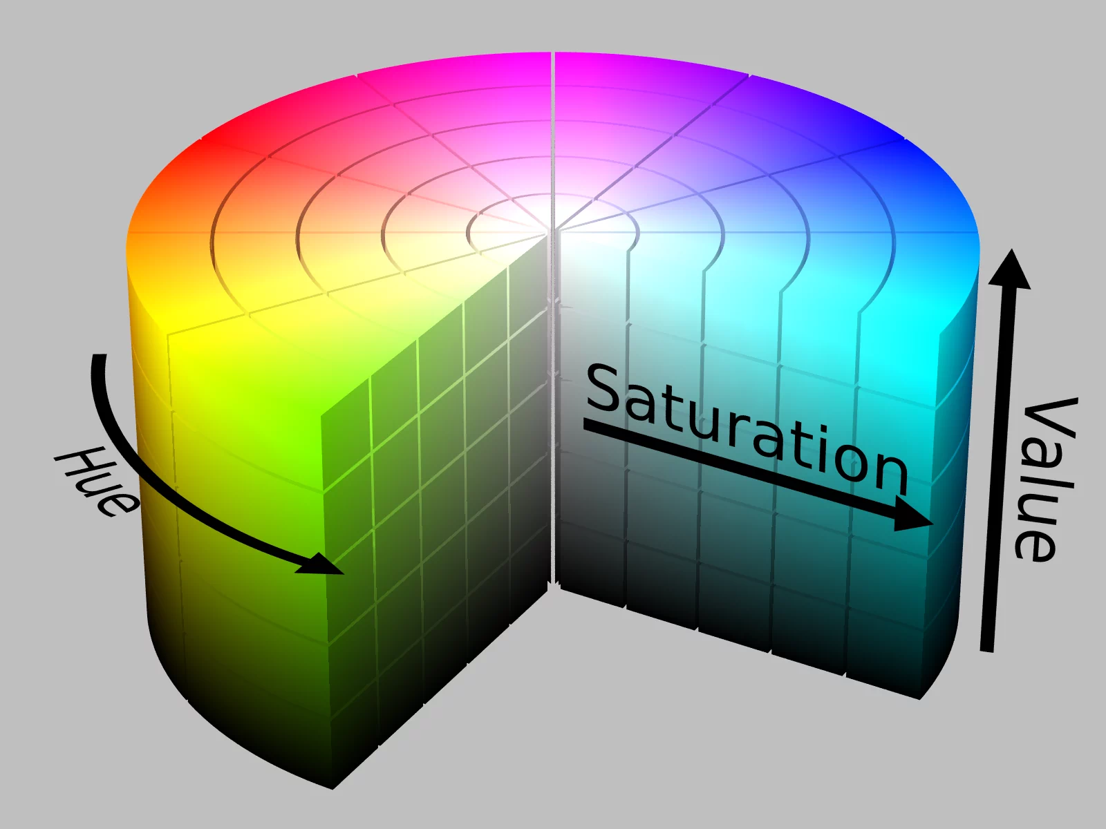
Saturation of value, that’s why.
Saturation is the intensity or purity of the color. And it’s one of the biggest culprits when it comes to ugly color work.
The second is value which refers to the brightness or the darkness of the color.
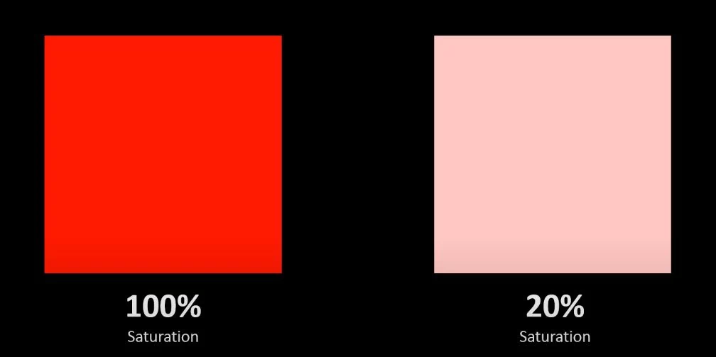
So let’s have a look at these. On the left here, it is 100% saturation, really hard to look at. But when we tone it down to 20%, it becomes almost a pink fleshy color again. I haven’t adjusted the color at all, but just changing the saturation gives you very different results.
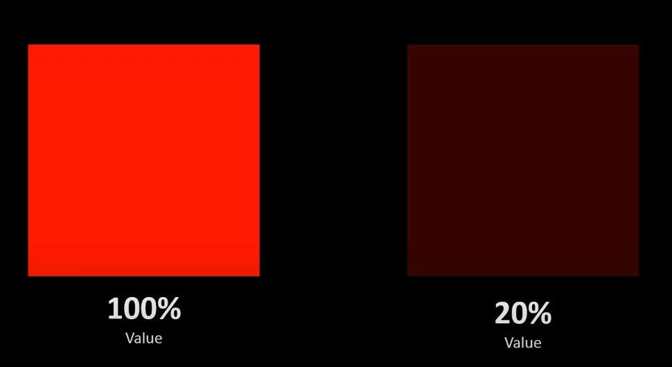
Let’s try it again with value 100% on the left, 20% on the right. You can almost barely see it. So that’s adjusting the brightness of the color basically. So you can see that it now looks more like a muddy brown than a red now.
If you had to tweak both of these, the saturation and the value, you can see that you can create a whole plethora of different shades all from just one raw color at the start.
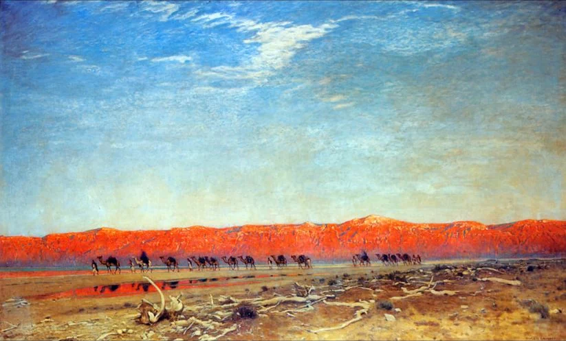
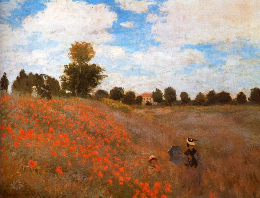
As is demonstrated in this painting. I’m fairly certain that the only color used in this painting is red. So just mixing it with white and black, you know. Changing the saturation and the value is able to create an entire image from just one color, It is very interesting.
Highly saturated color
Now in the CG world, saturation is probably one of the biggest offenders. A lot of artists choose highly saturated colors because they think it will make the results look much better.
But really? It couldn’t be further from the truth.
Highly saturated colors not only look incredibly fake, but using saturated colors everywhere makes your eyes nowhere to rest, which is really important in the image.
Have a look at this, as you can see, when you stare at it for too long, it becomes a little bit irritating.
So desaturated areas of your scene are very very important. But that’s not to say that bright saturated colors are all bad.
In this example you can see that your eyes are automatically drawn to the red, bright mountains in the background there. That was deliberate. That can be used as a compositional element. So your eyes are following back and forth along the same path as the camels are traveling, very cool.
And in this image, it’s pretty clear that the artist wanted you to notice those flowers. It’s also called wild poppies which is kind of a giveaway. But the red highly fluorescent color of them, it almost jumps off the screen edges. So it is really startling and probably the one element that you remember this image for.
And it could also be used for storytelling. Throughout history if you have a look at a lot of paintings, Jesus is always wearing red. And that’s basically to focus the attention on him and also to make him look powerful and mighty.
And in terms of cartoons, highly saturated or bright colors can actually work in your favor, because it can immediately note to the viewer that they’re looking at something which is fake. And it really plays to its surreal unrealistic qualities.
Brightness and saturation can even adjust your mood.
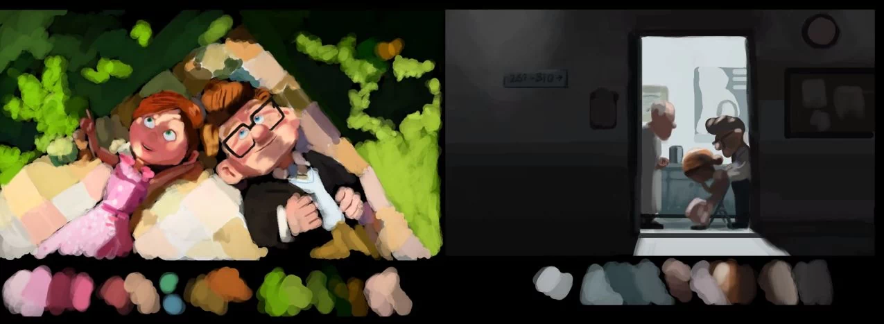
Brightness and saturation can even adjust your mood. They are very important in the packaging design process of the color printed paper boxes. If you remember at the start of up, the colors were very vibrant. There was a lot of oranges. There was pink fluorescent grass and really vibrant colors. This was to signify the joyous happy moment in their lives.
But then it turned to sadness and the colors immediately changed to very desaturated tones, a lot of grays, a lot of browns. And if you have a look at that image on the right there, I mean there’s almost really no color at all. I mean it’s just a little bit of blue, kind of some brown in there but nearly all desaturated, so that helps you to feel the coldness and the loneliness that the characters are experiencing. This same effect was used at the start of the Incredibles and as well as the matrix. Color is a really powerful mood changer and it’s used a lot in Hollywood as well as video games which is why Call of Duty is completely desaturated, almost.
It can also be used for composition. When you have a look at this image, your eyes are probably automatically drawn into the background there, where there are some dudes wearing some gnarly red pants. So it’s really guiding your eyes from the foreground to the background just by having something highly saturated, so very important.
A similar effect can be seen right here. If it weren’t for that highly saturated parrot there in the
foreground, it’s unlikely that this image would be as successful as it is. The parrot really gives you something to anchor yourself to. So, you’ll then free to explore the rest of the scene, so to speak.
So just to summarize what I’ve already spoken about saturation and value in a nutshell.
- Don’t overdo it. Don’t saturate and use high values all throughout your scene. It will always come out horrible.
- Use saturation and value to guide the viewer
- Use it to tell a story, who is powerful, you know, what you are drawing attention to.
- Use it to change the mood, use vibrant colors in an animation and desaturate it, you know, when you want to change it to be sad
- Use it to draw attention to something that otherwise wouldn’t be getting attention.
Color Harmonies
Saturated and value leads us to point number three: color harmonies. Sorry for blinding you there I love this topic.
Color harmonies basically pertains to the fact that some colors look better together than others. It’s also known as color schemes or complementary harmonies. It has a number of different words.
What I’m going to be talking about is six popular and common color harmonies that work well. They’re based on concrete ideas and you can start using them in your work straight away.
1. Monochromatic
The first one is monochromatic, probably the easiest one to start with, because it involves only one color. The entire image uses just one color.
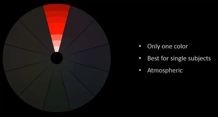
This is best for single subjects, because it forces the viewer to focus on the details of the image, the changes in the value or the saturation.
And it could also be used to create a very striking atmospheric effect as will be demonstrated right now. So you can see here, your eyes are drawn to the silhouette of the rocks and the figures. And you’re focusing on the story as opposed to the colors. It is very cool.
And this image here, a slide from that yellow moon at the top there is entirely painted with red, giving a very striking atmospheric effect.
And this next one, I absolutely love creepy chilling. And it’s all using one color, yellow. It is a very cool effect and use very well.
2. Analogous
Number two is analogous. This one is cool. It’s about colors that are next to each other on the wheel.
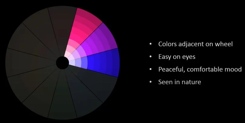
Thus you know about the distance you can see right there. The cool thing about this one is that it’s easy on the eyes. It creates a peaceful and comfortable mood mainly because it is seen a lot in nature. You know green trees, blue skies and things like that. The colors are very related. Let me give you some examples.
In this image here, the stylet might almost look monochromatic since there’s a lot of purple in the background there. But you can see over here, if I put my mouse here, you can see there is a blue sort of shore resting on that chair there. Then you’ve got this striking pink flower there. It is really a brilliant use of that color scheme.
Here as the example of nature, you’ve got some dark green grass here, and you’ve got some light green up here in this tree here and then of course the sky with a delicate blue there.
And this image is really outstanding example, totally striking. You got this lovely red dress and then the use of purple and pink’s throughout the rest of the scene.
And this image here, aside from a couple of areas where there’s the blue, the rest of it is all using yellow, orange and red. If you look in the background there, yellow taxi, you’ve got some orange signs, red car, etc. It is so really pleasant effect.
3. Triatic Color Harmony Scheme
Number three, the triatic color harmony scheme is probably one of the hardest to pull off. It involves colors which are equally distant to each other on the wheel. It’s really best for cartoons or surreal scenes because it can come across as being quite playful.
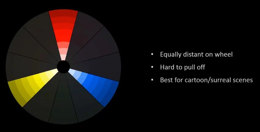
It’s probably not the best example to put right after that. But you can see here again, Jesus is wearing that striking red and then using blue and yellow to highlight other elements. And it’s created a very pleasing-looking result.
And here is a really outstanding example. It doesn’t have to be just the primary color by the way. The triadic can be equally distant to each other on the color wheel. This one is using mainly orange green and blues. And you can see it’s a really significant effect. It comes across really cheerfully and just really nice.
4. Complementary
Number four is complementary. This one is probably one I’m sure you’ve all heard of before. It’s basically colors that are opposing each other on the wheel so it’s very popular. A lot of artwork not only today but throughout history use complementary color schemes. It is widely used on the color design of the printed paper boxes.
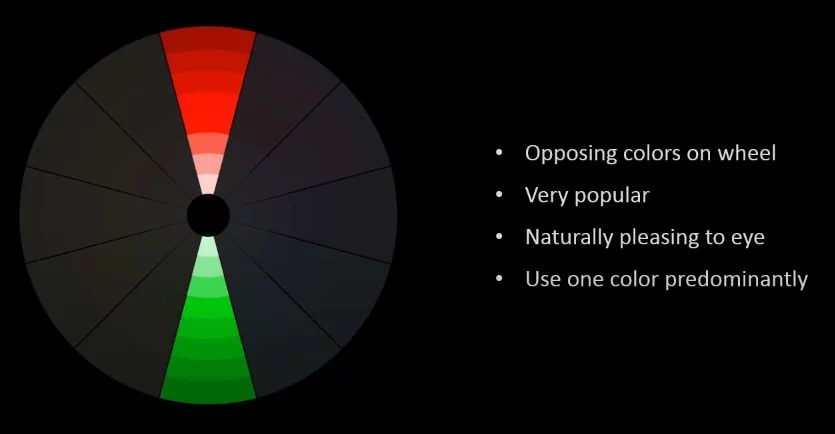
It’s just naturally pleasing to the eye. Colors that are opposite to each other on the wheel just look better. They just looked nice next to each other.
But something that a lot of people don’t mention is that you shouldn’t use both colors equally like you shouldn’t use 50% grain and 50% red. You should be using one color predominantly, generally the weaker color.
In this case if you’re using green and red, you’d be using the green the most. You’d be using that for like most of the scene and then using some splashes of red.
Like some really desaturated greens and then some you know saturated areas of red, have a look at some examples here. We go very similar to the movie Brave I think. You could see a lot of green. She’s wearing a nice green dress there. There is a lot of green along the grass there, and then this red shawl, her red hair, the sunset. Everything else there creating a really nice scheme.
Here this one is a lot harder to notice since it looks almost monochromatic, a lot of yellow throughout everything. But if you look way in the background there, you could see some violet color. That is a complementary color scheme.
And here I love this one. It’s a splendid example of using cool and warm colors which are naturally complementary.
And that can also be used to affect the mood of the of the scene as well if you want a certain part of the of the scene to look sort of cold, then using blue cool aqua type colors can have that effect. And then using warm colors such as red and orange can make it look inviting or pleasant.
And this one really popular one that was on CD Society for a long time by Tony Brett in civic. Using the red and green color scheme coming across really really nicely and very powerful-looking effect.
And this one here very obvious red and green seems to be a very popular complementary scheme. And in this example here as I showed you before, we’ve got aqua for most of the elements and then in the background there you’ve got some highlights of some warm orange lights and especially on the screens there. But there’s virtually almost no other color in the scene which is kind of interesting.
And in this one here I love this one Drogo from Game of Thrones, it’s mostly yellow, mostly. It has this yellow, orange tinge to it and you might be thinking where is the blue. Well, it’s
Here it’s from the rim light. And I would say without that blue, this image would not look as striking or as good as it does. That blue even though it’s really subtle, and it’s only a small amount. It really does help to balance out the heavy use of this yellow color.
5. Split Complementary
let’s talk about split complementary.
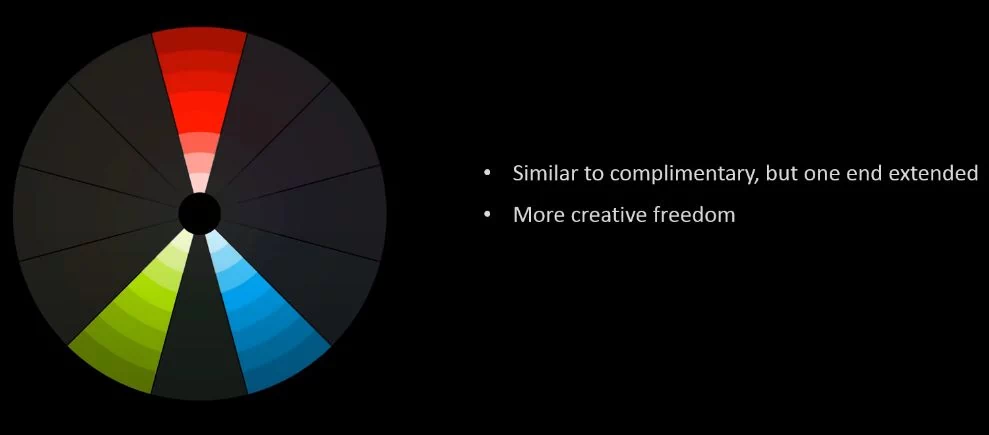
Split complementary color schemes are very similar to the complementary. It uses opposites, but basically you take one end of it and then you split it. It allows you more creative freedom, instead of just being locked to two colors. It allows you to use three colors. Generally, this type of color scheme feels more lively and joyous.
I’ll give you an example here. I love this painting, really nice use of some purple all through the flowers. And then you’ve got some yellow flowers, the green plants and yellow in the background. Basically, there are just three colors all throughout the whole thing, and it’s a really striking very pleasing looking result.
Regarding this one, I love this image. We’ve got some really nice orange trees, this striking green lawn and the nice cool blue calming sky. These three colors going together, they work out really well. Even though they’re really highly saturated, there are elements of low value and desaturation, like you can see these trees in the background here. They’ve been desaturated. This main foreground has this orange against this blue which are naturally complementary as well. They go really well together. And you’ve got some dark areas in the grass etc.
As for this one here, it’s a little bit harder to notice, but you can see obviously you’ve got some yellow on the robot itself and then the blue sky. You might be looking where is the orange. It’s in the sunset in the background there, very subtle. But again it does give you a little bit more freedom using three colors as opposed to two.
Regarding this one here, I love this one by Carlos. It’s a great use. It looks like two colors but actually it’s three. So, we’ve got this blue color which is going through the hair on the dress, then the plant itself. You’ve got some especially on those stamens flowers there. They come out as this aqua color, almost a greenish sort of color in the background, even a little bit of purple there. It is really nice use of the split complementary scheme there.
This one again is a split complementary scheme. It’s just blue and orange there on the book. But if you have a look at the hair, you can see that it’s red. It’s got a nice red tint to it, especially on this curtain over here. And there’s a little bit of red, a nice use of three colors. They’re coming out really nicely.
And I really love this image. It is great use of colors especially for a cartoon scene, highly saturated, lively, joyous look. You’ve got the yellow bananas, the pink flower, very vibrant in her hair and then the green trees and this dress here. And you could argue that there’s some blue, blue sky and the sea. But I would say there’s a lot of green in that like. It’s more of a greenish aqua. And as you can see, I mean the results speak for themselves, lovely and dazzling looking image. It is great use of the split complementary scheme.
6. Double Complementary
Finally, let’s talk about Tetratic. Its other name is double complementary. It chooses two pairs of opposites and it doesn’t really matter where they are on the wheel. Just choose two different pairs. Therefore, it’s best used for foregrounds and backgrounds. I would wouldn’t really recommend using it for -like mixing everything in the same sort of area. It’s a little hard to describe. I’ll show you some examples in a second.
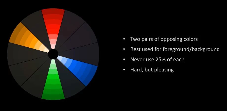
While using the foreground, you might want to have one pair and the way in the background maybe balance another pair. Never ever use 25% of each. Like what I said before about using complementary colors, don’t use 50% to 50%. It is the same with this. If you use 25% of each, it would just look horrible. It would just be chaos. For the weak colors, use them primarily. And then use the splashes of the brighter colors. It is hard to pull off, but it can produce some pretty pleasing looking results. Having a look at this one, for example, this is an example of the foreground and background. The foreground is using the green and red parent. And the way in the background is sort of hard to see. But you’ve got some violets and some yellows coming through there. Hence, that’s an example.
This one here is another example. You might not think it is a double complementary. But you have a look at it more carefully and you’ll notice it. You’ve got this reddish orange building there, which makes up the red. Then you’ve got the yellow coming through on this light here, as well as in these buildings here. The blue is coming through on the sky which just leaves the green left, and that is in the water, very desaturated, really nice use of it. But this nice green murkiness and some splashes of green in the plant here, and the vine are a really nice use of four colors together.
I love this one too. It’s an excellent use. The main color for this image, which your eyes are most drawn to is the red hat. The opposite to that is this jacket or hoodie that is wearing, which is this green color. Looking at this color wheel, you can see they’re paired, the red and the green. So where’s the other two colors in the background? You can see the background mostly blue with some little yellow bouquet effect lights in the background there. Thus again that’s foreground and background, just pairing the two. The foregrounds is paired and the background is paired, creating a really nice pleasing result.
Then finally we can look at this one. You probably wouldn’t think it is using four colors, but again it is there. There is a lot of blue. But you could see that there’s a difference. You’ve got this aqua greenish bright blue and this deep murky blue. These are the two different blues there. And then you’ve got this nice blonde yellowy hair here, and that goes in really well with that deep blue. Those are nice complementary colors. Then the skin is this warmer oranges color and you’ve got some even some red lips there as well. That goes balancing this aqua color which is in going into her mermaid tail. They’re really nice use of it. Those nice vibrant funky colors again really plays to the surreal qualities of a cartoon render.
Let’s summarize this whole post.
- Use it sparingly not over the whole thing. Use it to highlight the areas of interest and to help tell a story think about the overall image.
- Use values of high content of high contrast to draw attention to things, and that’s basically brightness versus darkness.
- Color harmonies. These are the six again.
- Monochromatic: one color
- Analogous: using adjacent colors
- Triadic: using equally distant colors
- Complementary: opposing colors on the wheel
- Split complementary: one complementary end extended
- Double complementary:just the two pairs of opposing colors
That’s pretty much it, guys. I’d leave on one last note. Don’t stress. Colors can be really fun. It can be stressful when you’re trying to experiment, to play with it, or to make something that works. It sometimes does just take a lot of practice to come up and have a like develop an eye for seeing a combination that will actually work with your scene. Especially with 3D scenes where you’ve got a lot of different shading and bounce lighting and stuff like that, that can kind of mess up your scheme sometimes. Therefore, just basically have fun with it and it can be fun, provided you don’t stress and just enjoy learning the colors.